Yes, your website has to be Responsive.
Being digital is not just about having a website anymore, a quality online presence has become a requirement for all businesses to grow. Regardless of your area of work, potential customers are likely to judge the quality of your business by the quality of your website. These days, business owners are finding that clients often discover them from search engines and social media platforms.
Having said that, when it comes to making that all-important first impression, nothing is more valuable than investing in a professional website design created to be user-friendly, and most importantly is responsive.
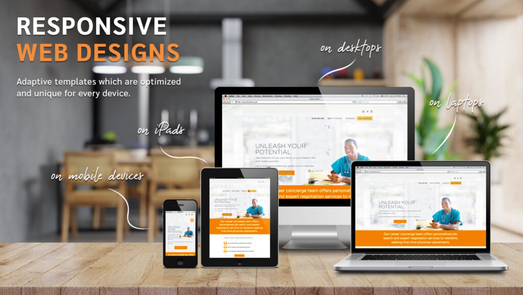
Websites are increasingly being viewed on a range of mobile and tablet devices first. For a website design to be effective and reach potential customers and convert target audience, your design must be responsive, cross-browser and multi-device compatible.
Apart from using different types of devices, web users are also using different sized screens and windows to view websites. One device’s screen could be much larger than another and desktop users may re-size windows while on your website. Responsive design guarantees that irrespective of what size screen or window a page appears on, the design will remain consistent and elegant.
Mobile First design
According to recent studies and an increase in mobile gadgets, over half of all web traffic takes place via mobile devices. This means that if you’re designing a website that only looks great on a desktop or laptop, you’re ignoring roughly 50 per cent of users who visit your site.
In response to this, many web developers shifted to a “mobile-first” or “mobile version” design, which prioritized creating excellent sites for mobile-sized screens first and then creating secondary, separate designs for larger screens.
Our crazy owls are equipped with the skills to create a responsive website for you. Let’s collaborate to understand how we can increase the digital footprint of your business.